
The theme this site was built on had so many accessibility issues that it had to be completely stripped down and heavily modified. We were able to modify the PHP code directly to address those issues, but not everyone has that ability. They don’t have the coding skills, the access rights, or they run the risk of introducing new issues. In the case of this site, we don’t dare do a theme update from the developer, because it would overwrite a lot of the fixes we made, and potentially introduce a lot of new problems.
But what almost everyone can do with very little knowledge and risk, is apply fixes using CSS. In this article we’re going to show you how to fix some of the most common accessibility issues just by adding a few lines of code to your style sheet. We’ll start with the easiest one first.
Redundant links
A very common issue we see is redundant links. That is two or more links which go to the same location. WordPress themes are rife with examples of this. You have a post with a heading, a thumbnail image, an excerpt, and “Read More” text, all of which are separate links which lead to the same post or page.
An example of this is OceanWP, which is one of the most popular WordPress themes and is in use on over one-million websites. A typical entry looks like this:
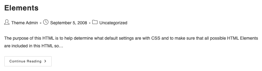
In this theme, both the heading and the “Continue Reading” text are links to the same post. Other variations of the theme have a heading link and a thumbnail image link instead of the Continue one. While this is not technically a WCAG violation, it is a huge annoyance for AT users, and it will flag warnings in accessibility checkers.
Here’s how the rendered code looks for one of those post entries (abbreviated for simplicity):
<article id="post-36" class="blog-entry">

<header class="blog-entry-header clr">

<h2> <a href="https://wp-themes.com/oceanwp/?p=36" rel="bookmark">Elements</a> </h2>

</header>

<ul class="meta obem-default clr" aria-label="Post details:">

<li><span class="screen-reader-text">Post author:</span><a href="https://wp-themes.com/oceanwp/?author=1">Theme Admin</a></li>

<li><span class="screen-reader-text">Post published:</span>September 5, 2008</li>

<li><span class="screen-reader-text">Post category:</span><a href="https://wp-themes.com/oceanwp/?cat=1">Uncategorized</a></li>

</ul>

<div>

<p>The purpose of this HTML is to help determine what default settings are with CSS and to make sure that all possible HTML Elements are included in this HTML so…</p>

</div>

<div class="blog-entry-readmore clr">

<a href="https://wp-themes.com/oceanwp/?p=36"> Continue Reading<span class="screen-reader-text">Elements</span></a>

</div>

</article>
Now, there’s a bunch of things wrong with this code; it has unnecessary elements like headers and aria-label attributes, link text which is not underlined, and things that are just plain wrong from a semantic standpoint like the fact that each entry is wrapped in an article tag. Article tags are meant to be used for full articles, not excerpts as they are here. For more on that, see our article Anatomy of an Accessible Web Page. But we’ll just ignore all that for the moment and focus on the matter at hand, which is that we have two links which serve the same purpose.
This is a very easy CSS fix. We’re going to do two things:
- Remove the redundant “Continue Reading” link
- Underline the text link so it’s purpose is clear and it’s not mistaken for a static heading
We can do that with two simple lines of CSS:
.blog-entry-header h2 a {text-decoration:underline}

.blog-entry-readmore {display:none}
If you don’t want the additional text to be visible for sighted users, you can add off-screen CSS as they have done:
border: 0;

clip: rect(1px, 1px, 1px, 1px);

clip-path: inset(50%);

height: 1px;

margin: -1px;

overflow: hidden;

padding: 0;

position: absolute;

width: 1px;

word-wrap: normal;
SC 4.1.2 – Name, Role, Value (Level A)
Unlabled Controls
While browsing one of my favorite news sites recently I came across a search submit button which looks like this visually:
![]()
But the button doesn’t have any link text or an arai-label attribute, so it is just announced as “button”:
<button class="search-submit" type="submit"></button>
Using the same technique we used in the last example, we can add a text label to the button:
.search-submit:after {

content: "Submit search"

}
Then use the off-screen CSS. to hide the label from sighted users.
State change not communicated
On this site we have a series of accordion controls: FAQs – Marymoor Live
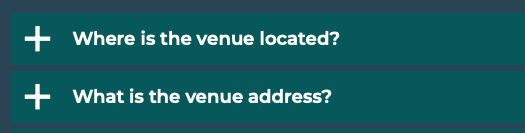
But whovever wrote the code incorrectly put the aria-expanded attribute on the container div rather than the button, so nothing is announced to screen reader users when the control is activated:
<div class="faq-title" aria-expanded="true">

<a href="#" role="button">

<h4>Where is the venue located?</h4>

</a>

</div>

<div class="faq-title" aria-expanded="false">

<a href="#" role="button">

<h4>Where is the venue located?</h4>

</a>

</div>
Consequently, they may mistakenly believe the buttons are broken. Once again we have CSS to the rescue. In this case, we are going to key off of the state change which occurs on the div when the link is toggled, and put the text where it should be:
.faq-title[aria-expanded='true'] h4:after {

content: " expanded";

}

.faq-title[aria-expanded='false'] h4:after {

content: " collapsed";

}
Now when a user toggles an accordion control, the screen reader will announce, “Where is the venue located?, expanded, button”, just like an accordion control which has been properly coded.
As you can see, CSS can be very useful not just for visual styling, but for improving usability and accessibility as well. While it’s true these are band-aid fixes, and they should not be considered a substitute for using proper labels and attributes, they can fill in the gaps in a pinch.